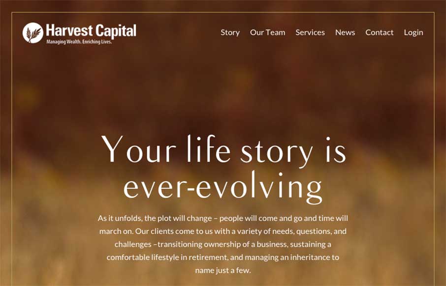
Interesting website here for Harvest Capital. I many ways I like the approach but have issues with it on other levels. I put it here in the gallery to hopefully get some feedback on it from you all. So, what do you guys think?
Harvest Capital wanted to convey their approach through not only text but also movement and visuals so as the client is exploring the website they feel like they are a part of creating the next chapter in their story.


0 Comments