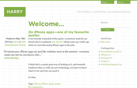
The latest iteration of Harry Roberts’ website. This one uses the 960 grid system and some minimal colors. I always enjoy Harry’s creations, his commitment to keeping his HTML/CSS pure is to be commended.
Glassmorphism: The Transparent Design Trend That Refuses to Fade
Glassmorphism brings transparency, depth, and light back into modern UI. Learn how this “frosted glass” design trend enhances hierarchy, focus, and atmosphere, plus how to implement it in CSS responsibly.


0 Comments