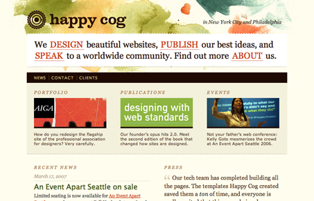
To be honest, I’m not sure why I didn’t review the Happy Cog website earlier, especially after doing the AIGA website (Happy Cog was the company behind that one). Happy Cog is a prominent website design company whose work includes Dictionary.com, AIGA, and much more. They have several strategic partners and great employees, all with fantastic design skills of their own.
The Happy Cog design is much more unique and effective than it’s predecessor. It makes better use of rich, bright colors that contrast the otherwise drab earth tones. Coupled with some great details in the graphics, the color scheme makes for a more effective design. When you just look at the site for a few moments, you’re attention is most likely drawn to the top of the page, where all the bright colors are. Since that’s the navigation, one of the most important parts of any site, it’s very effective.
The unique navigation, a paragraph style approach, is one of increasing usage across the Web. Happy Cog’s isn’t too complicated nor long, and as such, it doesn’t get lost in the crowd. A standard list-based sub-menu is still available, which might serve to alleviate some frustration users may have with not immediately recognizing this alternate approach to navigation menus.
For some great colors and uniqueness, and some valid XHTML and CSS, Happy Cog is unmatched.


I don’t believe this site gets the praise that it does. Not only is the alternative navigation not original, it’s becoming cliche (and not because happy cog started it– they most certainly didn’t). Happy Cog continues to be unoriginal, and still strives to create mediocre looking sites with semantic markup. Big deal. Nothing to see hear, move along.