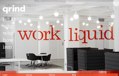
Grind seems like a very cool co-work space in NYC. Make sure to check out the video at the ‘what’ link, it’s beautifully done. And I have to say, $500 doesn’t really seem like a bad deal for that area, and for such a modern, hip space. I’m assuming the coffee is free, otherwise what’s the point. I’m not so sure about the name ‘Grind’, however. While it’s synonymous with working hard, it also conjures up negative aspects of working, like getting burnt out and ground down.
That said, the site does a good job of matching the feel and vibe of the space itself. The parallax effect is well-executed and the use of Clarendon-like font is a good choice. It would be nice if the main content column was a little wider, I think it would help show off the video, photos and illustrations. Overall, I really like this site and envy all those ‘Grindists’. I guess ‘Grinder’ was taken by a sandwich, though.


0 Comments