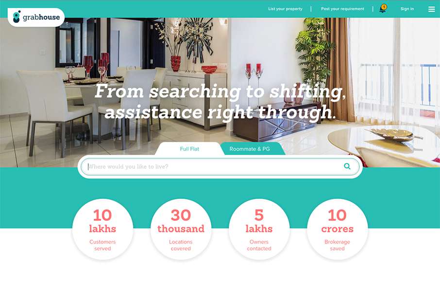
Pretty utilitarian design for Grab House, but somehow they’ve made it look appealing visually. I dig the search box area and then as you scroll down there are timed info blocks that load pretty smoothly.
Glassmorphism: The Transparent Design Trend That Refuses to Fade
Glassmorphism brings transparency, depth, and light back into modern UI. Learn how this “frosted glass” design trend enhances hierarchy, focus, and atmosphere, plus how to implement it in CSS responsibly.


0 Comments