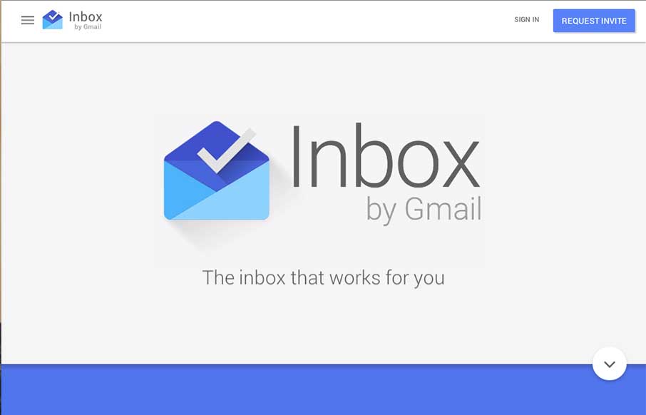
Pretty cool page for Google Inbox. I dig the intro animation that smooths into the main page layout. Interesting approach to the page navigation, working mostly like a slideshow but scrolling down instead of left to right. Not exactly responsive all the way, maybe that’s on purpose?
Glassmorphism: The Transparent Design Trend That Refuses to Fade
Glassmorphism brings transparency, depth, and light back into modern UI. Learn how this “frosted glass” design trend enhances hierarchy, focus, and atmosphere, plus how to implement it in CSS responsibly.


0 Comments