goodcorps.com

goodcorpscom

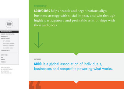
There is some really badass design within this site, but I feel like the experience is a bit compromised by the nature of the long scrolling design. It’s beautiful to look at, but you miss content when you flip from nav element to nav element, you have to mix clicking and scrolling which there is a huge distance between the nav on the left and my scroll bar.

Nitpicky I know but the site is so damn beautiful it pains me to use it and have the experience I had. I’m torn on this site…

0 Comments

Submit a Comment

Your email address will not be published. Required fields are marked *

News & Articles

The Essential Guide to Getting Started on Freelance Writing

The Essential Guide to Getting Started on Freelance Writing

Explore the lucrative and fulfilling world of freelance writing with our essential guide. Learn about specialties like blogging, social media, article, and technical writing. Build a portfolio, find work, set up your business, and discover the potential earnings. Embrace the freedom of working from home and follow tips for success in your dream career.