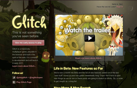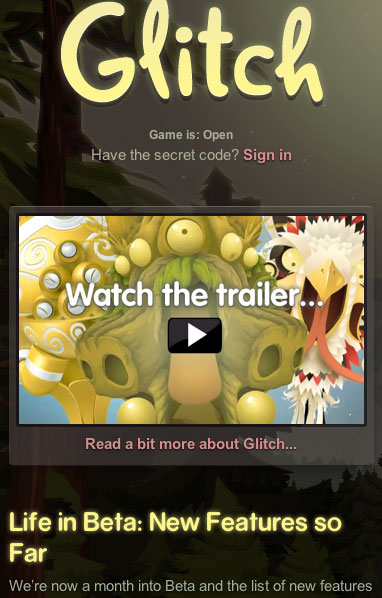
From a purely design standpoint, glitch.com is well structured with legible type and enough conventional design patterns to ensure easy navigation but, really, those details are fairly pedestrian. Where glitch shines is its creative direction. Glitch looks like its shaping up to be an interesting experiment in online gaming and the site exists as a marketing tool and a portal to join the community. As such it takes full advantage of the incredible abundance of art created for the game and acts as an extension of the experience. Its a great example of design being lead by concept.
Glassmorphism: The Transparent Design Trend That Refuses to Fade
Glassmorphism brings transparency, depth, and light back into modern UI. Learn how this “frosted glass” design trend enhances hierarchy, focus, and atmosphere, plus how to implement it in CSS responsibly.


0 Comments