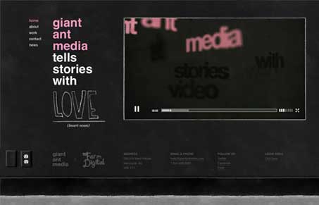
This a really great design. It’s minimal and tight yet dirty and open at the same time. The design is nice but recedes so you can take in the reel and other portfolio samples quickly. There’s a lot of little detail here and it can be overlooked but that’s what I like most about this design. The detail is there and you discover it as you spend time with the site. The open reel is freaking awesome too, so check that out if nothing else.
Glassmorphism: The Transparent Design Trend That Refuses to Fade
Glassmorphism brings transparency, depth, and light back into modern UI. Learn how this “frosted glass” design trend enhances hierarchy, focus, and atmosphere, plus how to implement it in CSS responsibly.


nice. Would have liked to see the video not confined to a bounding box with a play button, but rather make the website itself the video. Very nice, and they are obviously quite skilled at what they do.
giantantmedia’s website is epic. Totally finessed with love.
Thanks for the love, unmatchedstyle!
—the GAM team