First of all: Badass domain name.
Second: Frostbite 3 looks like it’ll blow your hair back and then some and I can’t wait to see it on the next generation of consoles. I’m a gamer and it looks beautiful.
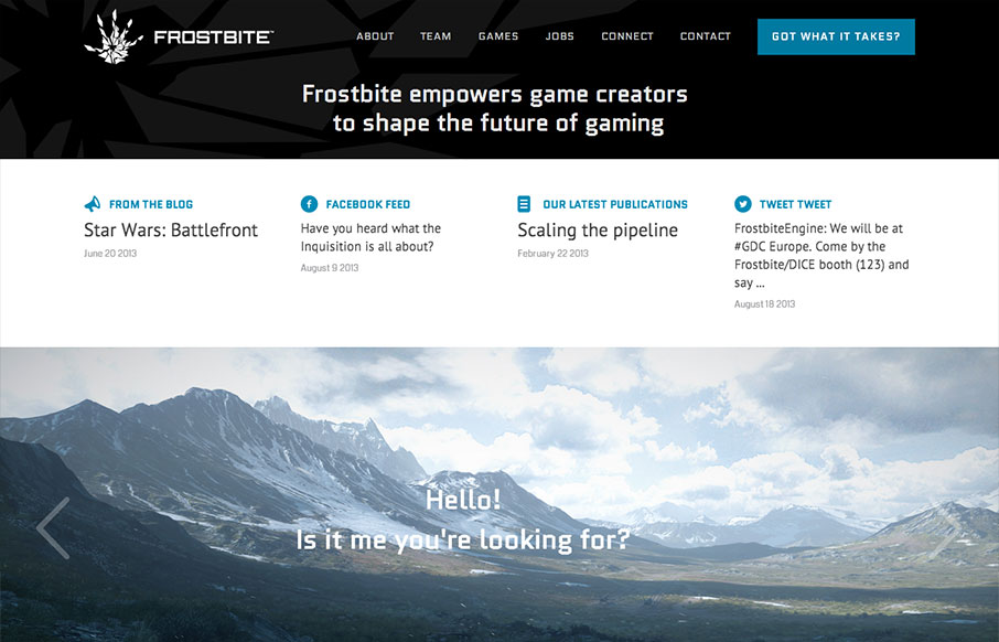
Third: Pretty nice site. Game studio/engine sites are usually way over the top with animations and crazily mashed images and text, but frostbite does a great job of incorporating a console game aesthetic without the structure and functionality of the site suffering.
frostbite.com is graphic and modular and feels highly structured and programmatic, which I think is perfect considering the site is for a game engine. It has a ‘rock solid’ feel that says a lot about their confidence in the engine. The limited color palette doesn’t interfere with the large photography used to showcase the engine’s abilities. A safe, but solid choice. The typography looks good, reads easily and couples well with the rest of the site.
All in all, super cool.


0 Comments