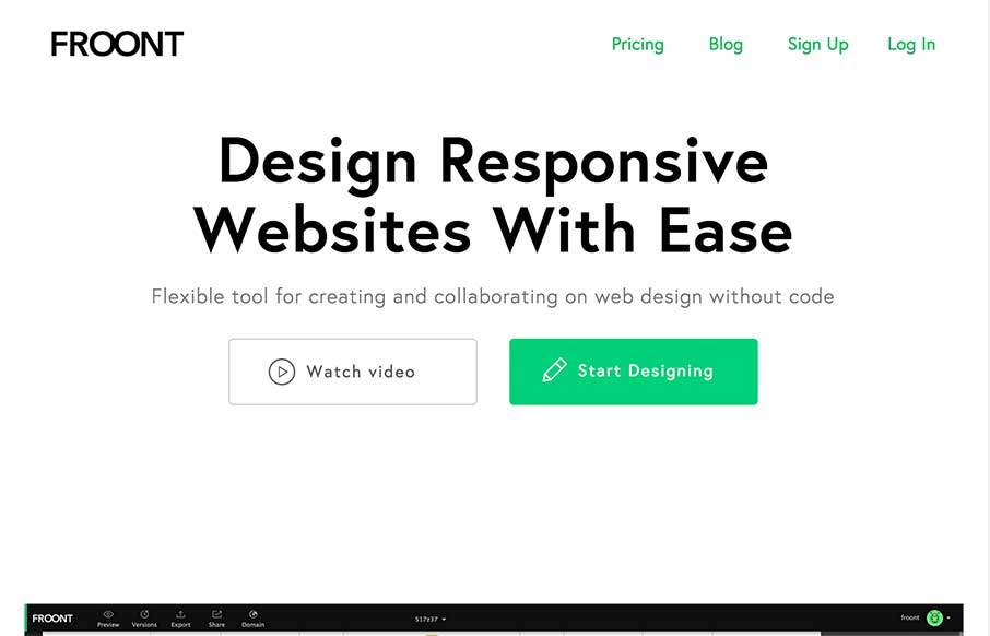
I LOVE the Froont website design. Man those gifs are fantastic for explaining what the heck the app is all about. Then the Features and Pricing section on the home page is brilliantly designed IMHO. Love it, all the way.
Glassmorphism: The Transparent Design Trend That Refuses to Fade
Glassmorphism brings transparency, depth, and light back into modern UI. Learn how this “frosted glass” design trend enhances hierarchy, focus, and atmosphere, plus how to implement it in CSS responsibly.


0 Comments