Submitted by Sunny Thaper, @sunnythaper. Designer & Developer.
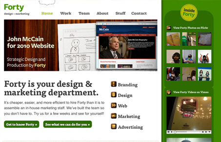
I like the Fortyagency.com website a lot. It’s unique but the first thing I noticed that makes is unique is actually the copy & overall vibe of the site. I really love the inviting tone to the copy, the photos and videos of the Forty team everywhere just makes you feel like you know these guys. The seem accessible and open and then when you really dig into the guts of the website you see they have tons of experience and great ideas to offer.
Visually, I like the green and wood background elements. The use of Typekit also let’s them utilize a very inviting typeface across the site design to help push that open and inviting feeling further.
Give the screencast review a listen and see if you agree with me.


Thanks for the great review! We really appreciate it!
You got it Mr. Thaper. You guys keep giving us good stuff to talk about so thank you!