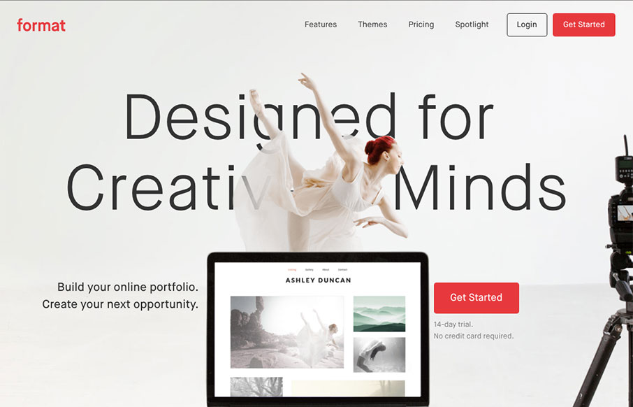
You know, I have heard a lot of belly-aching from designers about pre-designed website platforms like Format (not specifically them, but others). My question to them has always been, “listen, is that website meeting the customer’s needs? Yes? Then what’s wrong with it?” (My underlying retort is really, “maybe you should wake and step up your own game then…” but I’ll leave those thoughts private..haha)
But really – I don’t know what the backend interface is like for Format, or how easy or difficult it might be to use for a non-web professional – but the example sites probably do meet the customer’s needs: “highlight my work so I can get hired again”.
Format’s site itself is clean and simple, and highlights their work so that they can “get hired again”… brilliant!
From the Designer: Recently redesigned, Format.com is a great reflection of our product: professional and creative, allowing the work of our community to shine through our online portfolios.
Submitted by: Lukas Dryja
Twitter: @nizm
Role: Creative Director
Country: Canada


0 Comments