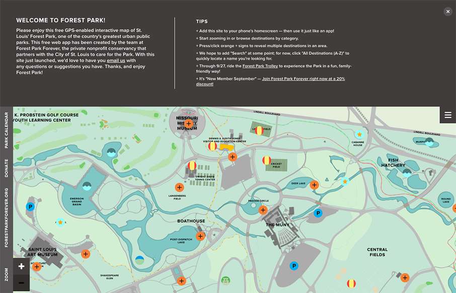
This map from Forest Park in St. Louis, Missouri is an information architect’s dream. Using both mobile and desktop, I’ve been able to get around the 1,371 acre park (virtually) in ways that make regular maps on websites look more than ancient. The navigation is different, but gives many different entry points to the attractions of the park, with good, quick info in both desktop and mobile versions. Wish more, larger parks / theme parks / museums / etc would do something like this. Good job!
Glassmorphism: The Transparent Design Trend That Refuses to Fade
Glassmorphism brings transparency, depth, and light back into modern UI. Learn how this “frosted glass” design trend enhances hierarchy, focus, and atmosphere, plus how to implement it in CSS responsibly.


0 Comments