fonts.com

http://new.fonts.com/

Looks as if Happy Cog just rolled out a new design for fonts.com. Here’s a super detailed blog post about it.

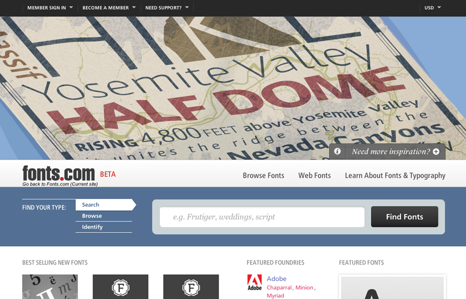
I like a lot of this new design. My particular favorite is the main image slideshow and how the main site colors change out as you experience it. Good hierarchy and minimal color and craziness make this a really solid design update IMHO.

Kinsta

2 Comments

  1. Ben Hayes

    Love it. It feels fresh and crisp and the colours are surprising. Great attention to detail and the Frutiger superfamily works very nicely. I’m envious!

    Little bit surprised they didn’t make it responsive, given that I would expect Happy Cog to be very forward-looking.

    Reply

Submit a Comment

Your email address will not be published. Required fields are marked *

Time limit exceeded. Please complete the captcha once again.

News & Articles

Brutalism: The Beauty of Breaking the Rules

Brutalism: The Beauty of Breaking the Rules

Brutalism in web design rejects perfection for authenticity. Stark grids, raw type, and honest structure create interfaces that feel human, intentional, and impossible to ignore. Break the rules, on purpose.

Monochrome Minimalism

Monochrome Minimalism

Monochrome Minimalism merges Bauhaus discipline with IKEA simplicity. Clean grids, muted tones, and functional beauty create digital calm, proof that restraint, not decoration, defines timeless design.

4 CSS Features That Changed Everything

4 CSS Features That Changed Everything

Over the past five years, a handful of new CSS features have completely reshaped how we build for the web. According to the 2025 State of CSS Survey, these are the true game-changers.