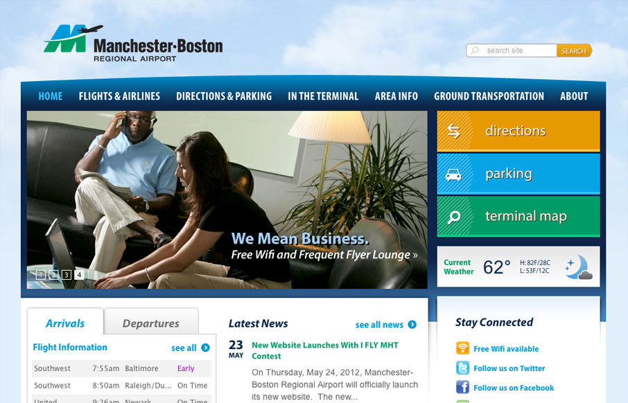
Well hey, check out the new responsive hotness over at flymanchester.com /via @webmeadow
— Responsive Design (@RWD) May 18, 2012
Really well done responsive design, the “directions, parking and map” main buttons are all treated very well at all the major breakpoints in this site. Particularly I like the iPhone to what must be Kindle sized screen’s treatments of those buttons.
Two things i’m noticing are: The site search seems really minimized visually, i’m not really sure why it’s even there, I bet it’s a client request… 🙂 Then the arrivals and departures are given the same visual importance as the news and social network links. I wouldn’t think that’s the case in reality, perhaps it’s a strategic design decision to make them equal. Of course I can’t tell being on this side of a critique, but thinking through what content is visually weighted over something else on a page is something worth thinking about for your own projects.


0 Comments