Flex Pantech

http://pantechusa.com/phones/flex

Via: Bob Galmarini on Dribbble

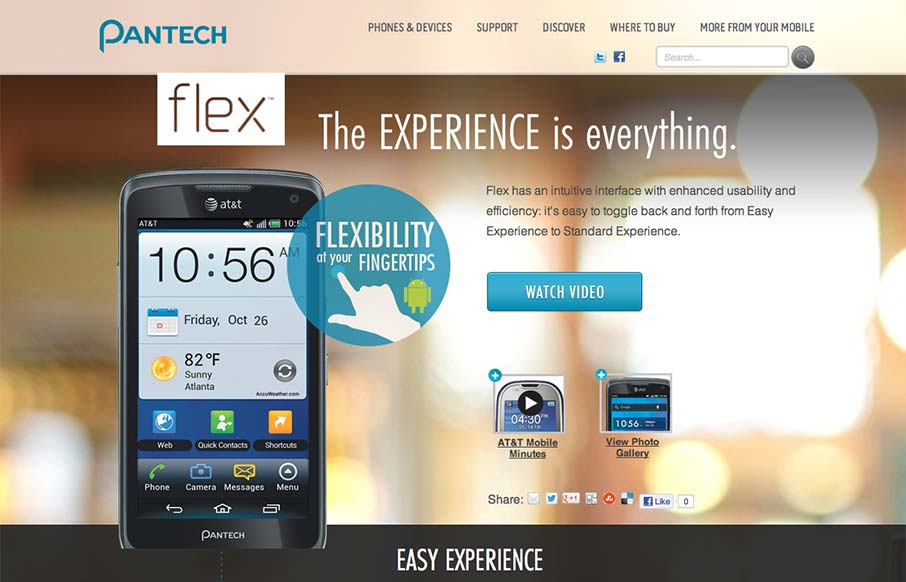
Really fun little microsite / landing page for the Pantech Flex went live today. Check out the screen swap to show off the different phone UI.

What a great website design. It’s just a single pager or microsite as they’re called but it’s really neat. I love the phone that scrolls down with you and then locks to the right in place like that. It’s honestly surprising and it’s a nice little moment for the user when you first start to notice it. I also dig the lower sections, very reminiscent of the way Apple does their product pages, they seem to have really gotten to the essence of you can tell a visual story about a product like Apple does and have done that in such a great way. Great work!

Kinsta

0 Comments

Submit a Comment

Your email address will not be published. Required fields are marked *

Time limit exceeded. Please complete the captcha once again.

News & Articles

How CX (Customer Experience) Can Combat Customer Churn

How CX (Customer Experience) Can Combat Customer Churn

A seamless customer experience (CX) can reduce churn and boost retention. Discover essential design strategies that transform frustrating user journeys into engaging, personalized experiences that build loyalty and trust.

Is Graphic Design Dead?

Is Graphic Design Dead?

Graphic design isn’t dead, it’s evolving. Inspired by a Threads post, this piece dives into the art vs. design debate, AI’s impact, and why selling your value matters.