Fivefootsix

http://www.fivefootsix.co.uk/

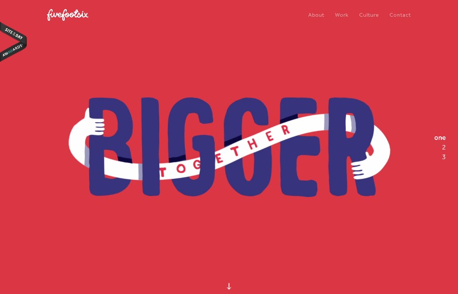
Interesting twist on mixing a large hero/video area and a slider like interaction. The home page scrolls well into the about section, I think it works pretty well actually. Simply because they don’t hide the nav under a hamburger nav and just lay it out. I do love the other sections of the site too, like the work section. Strong design all around for Fivefootsix.

From the Designer:
Fivefootsix are a brand and design agency. There’s in-depth project stories, new work, news in the Culture section and a series of wonderful illustrations.

Submitted by: Orlando Festa
Twitter: @rollstudio
Role: Designer & Developer

0 Comments

Submit a Comment

Your email address will not be published. Required fields are marked *

News & Articles

Sign-Up: Enhancing Conversions through good UX

Sign-Up: Enhancing Conversions through good UX

Optimize your website’s sign-up process by focusing on clarity, ease, and user mindset. Clearly explain the purpose, benefits, and steps, and use social proof to build trust and drive conversions.

The Essential Guide to Getting Started on Freelance Writing

The Essential Guide to Getting Started on Freelance Writing

Explore the lucrative and fulfilling world of freelance writing with our essential guide. Learn about specialties like blogging, social media, article, and technical writing. Build a portfolio, find work, set up your business, and discover the potential earnings. Embrace the freedom of working from home and follow tips for success in your dream career.