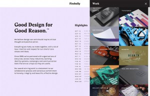
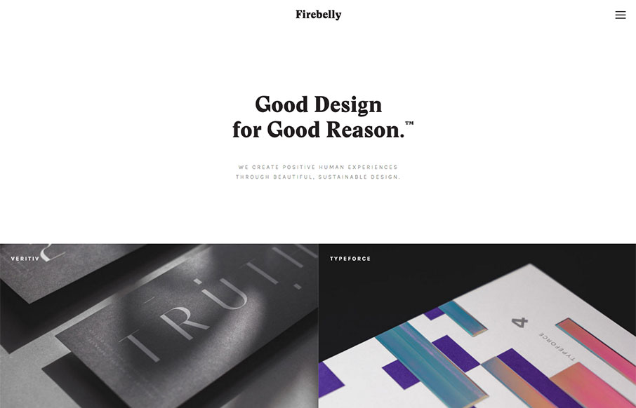
Really dig this site from Firebelly out of Chicago – especially for the hamburger boxes off the About page. They’ve made a strong decision to emphasize their work (see the home page is the Work page), and allow you to filter the work from the off-screen nav (to not distract from it) – and then they have special off-screen nav / hamburger drawer for just their work (see below). Nice!


thanks so much for the kind words!!!