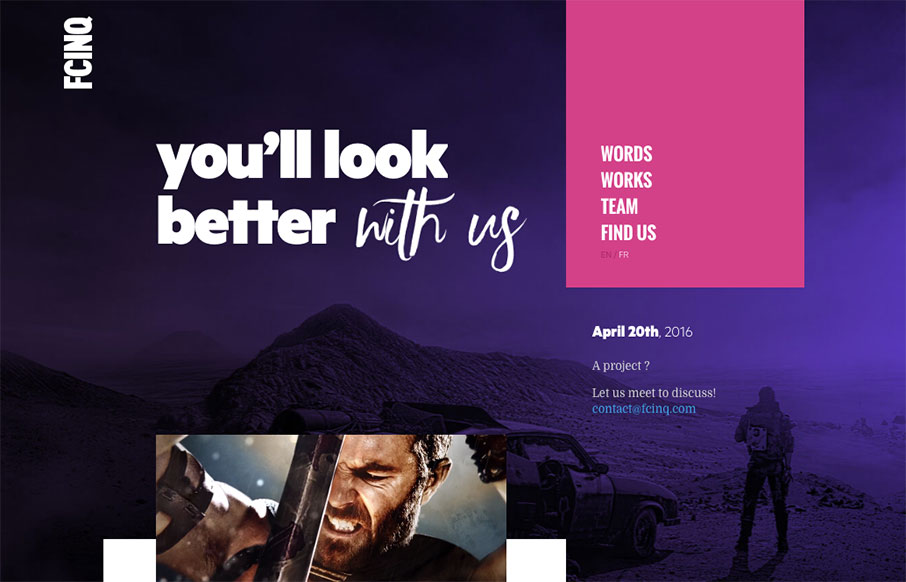
Woah. That’s what I said when I first loaded this site up. It’s plenty full of visuals and good looking teaser imagery. It’s pretty solid in execution too. I love that first moment when you start to scroll this site down the most. It’s a nice little surprise as the blocks of colors and other content slide around a bit.
Glassmorphism: The Transparent Design Trend That Refuses to Fade
Glassmorphism brings transparency, depth, and light back into modern UI. Learn how this “frosted glass” design trend enhances hierarchy, focus, and atmosphere, plus how to implement it in CSS responsibly.


0 Comments