
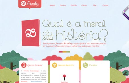
Love the illustrations of the trees in the background. The little multicolored squares that denote the screens in the slideshow(s) are subtle and skirt the line between not reading like slideshow markers at all. The way the logo and top nav is treated visually is rather nice and inviting looking to me. Overall nice site design.




0 Comments