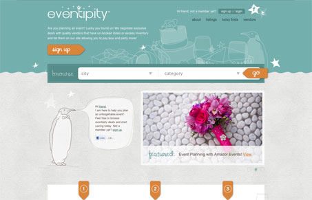
There are two things that I find engaging with this website design. First is the search, or “browse”, design. It looks very much like a large search bar, but is broken down with two select boxes. It is rather intuitive and even though it could just sit there and function as normal navigation would, the fact that it’s laid out as a search bar makes it feel more useful and that the website is doing way more than just sorting content. The other is the vibe the site gives you, it really has the tone of a business that’s going to help you do what they say they’ll do. That’s not always easy to do. Very nice work here.
Glassmorphism: The Transparent Design Trend That Refuses to Fade
Glassmorphism brings transparency, depth, and light back into modern UI. Learn how this “frosted glass” design trend enhances hierarchy, focus, and atmosphere, plus how to implement it in CSS responsibly.


0 Comments