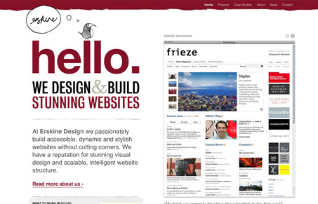
Erskine Design is one of those websites that’s been around for a while but I’ve just not put in the gallery here at UMS yet. It’s a simply gorgeous website. Really basic two column layout with minimal color, which in my opinion makes the design and composition of this site a classic. The typography is one of the best examples of visual hierarchy i’ve seen and the sub pages have all been tweaked to really showcase the content of each particular section. Really really great work on this site.
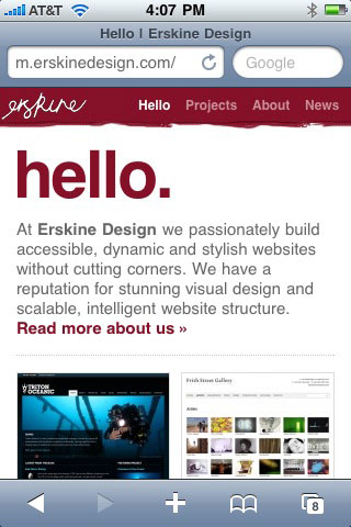
They have an iPhone version of the Erskine Design and like it’s ‘parent’ it has a lot of the same qualities. Though not as sharply designed, and has far less content accessible within it as the main website, but over all it’s nice and clean.
You can see the live mobile/iPhone version here: http://m.erskinedesign.com


0 Comments