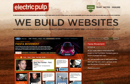
Relaunch of Electric Pulp’s website. Often imitated but never reproduced, they created one of my favorite websites with their past design and with this relaunch they’ve continued with that same theme. The background image is immaculate and I love the feel the type has, feels like it’s been ‘wood burned’ into the wood. The simple grid makes the site feel clean even though they have the wood image and most of it feels a bit grungy and hand made looking. The blog is also rather nice with the way it treats the different types of posts.
Glassmorphism: The Transparent Design Trend That Refuses to Fade
Glassmorphism brings transparency, depth, and light back into modern UI. Learn how this “frosted glass” design trend enhances hierarchy, focus, and atmosphere, plus how to implement it in CSS responsibly.


0 Comments