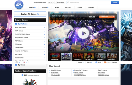
There is a whole lot going on with the new EA website. From the drop-down elements in the top navigation to all the javascript detail work.
Fantasy Interactive is the firm behind this one (one of my favorites, gotta love that Swedish design!). They have a cool blog post that sheds some light on the thinking behind the re-design:
Knowledge of what keeps one consumer base engaged and returning and another more apt to purchase were combined together accomplishing the overall project goals. The new portal serves as a destination whereby EA could learn as much about its users as its users could learn about EA’s products.
It’s solid from top-to-bottom, it’s not often a big site like this will go for the minimal/clean look… Spend some time on it and enjoy.


I don’t get why they have the total games number at the top in some prime real estate. It seems pointless.
Yeah, if they’re playing the game of ‘I have more games than you” they win…