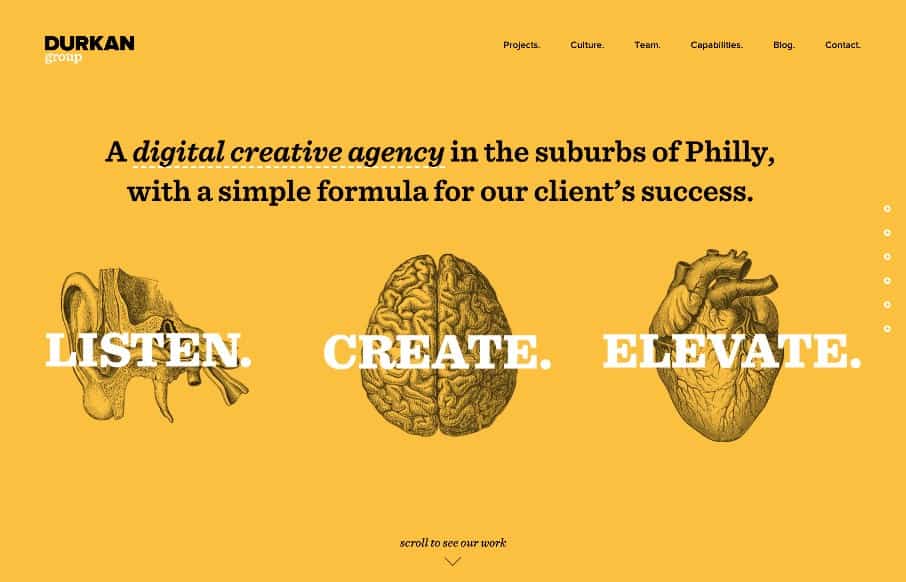
I like how they homepage is like a big splash page, but instead of being just a hero image and some useless “welcome” copy, they’ve incorporated direct links and images to their case studies. What I don’t like is how that’s echoed in the “projects” section which is the first link in the header nav, but I get it for subpages. I like how the nav is all streamlined across this website and you don’t really even need that main header nav to get to what they want you to see.
Glassmorphism: The Transparent Design Trend That Refuses to Fade
Glassmorphism brings transparency, depth, and light back into modern UI. Learn how this “frosted glass” design trend enhances hierarchy, focus, and atmosphere, plus how to implement it in CSS responsibly.


0 Comments