dribbble.com

dribbble

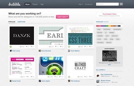
Where to start on Dribbble? There’s so much to go over I’m afraid I can’t do it service really. So i’m just going to point out my favorite parts of the design.

My absolute favorite part of the design is that it’s deceptively simple. There’s no typekit or Cufon here, it’s all straight up use of Helvetica. The main page is packed with stuff too but it feels open and airy and not at all overwhelming.

The detail worked into the website is also deceptive. There’s a ton of it but it’s not just thrown in your face. There are little nuggets of greatness from the animation of the dribbble basket ball when you upload an image to the way the tags are displayed like a graph.

There’s so much to take in here design wise, and Dan Cederholm is truly a master at work with Dribbble.com.

1 Comment

  1. oykun.yilmaz

    I so much want a dribbble invitation! but nowhere 🙁

    Reply

Submit a Comment

Your email address will not be published. Required fields are marked *

News & Articles

Sign-Up: Enhancing Conversions through good UX

Sign-Up: Enhancing Conversions through good UX

Optimize your website’s sign-up process by focusing on clarity, ease, and user mindset. Clearly explain the purpose, benefits, and steps, and use social proof to build trust and drive conversions.

The Essential Guide to Getting Started on Freelance Writing

The Essential Guide to Getting Started on Freelance Writing

Explore the lucrative and fulfilling world of freelance writing with our essential guide. Learn about specialties like blogging, social media, article, and technical writing. Build a portfolio, find work, set up your business, and discover the potential earnings. Embrace the freedom of working from home and follow tips for success in your dream career.