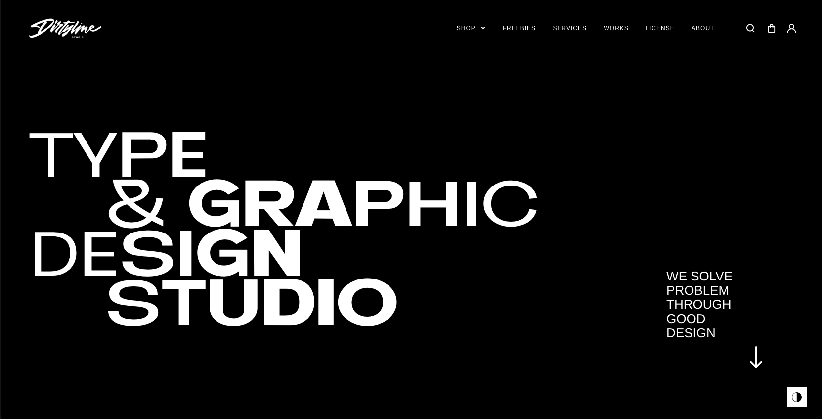
Real nifty layout with fun details. I like the movement as I scroll and the overall vibe here. I really love that red, contact, section – the moment you see it as you scroll is solid.
Glassmorphism: The Transparent Design Trend That Refuses to Fade
Glassmorphism brings transparency, depth, and light back into modern UI. Learn how this “frosted glass” design trend enhances hierarchy, focus, and atmosphere, plus how to implement it in CSS responsibly.


0 Comments