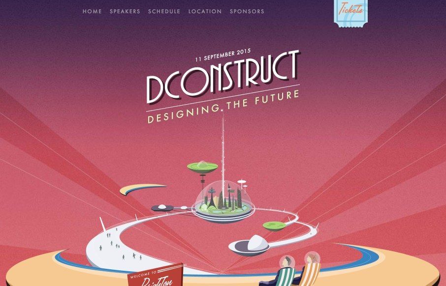
There is a lot to love about the 2015 dConstruct site. Clearleft always does something cool with this site every year, I always enjoy it when they launch it. I really like how it doesn’t take itself too seriously with the layout (mobile vs. desktop). It’s a conference website so just give us the goods, right? That’s what they do! I also really love the mobile nav design after you open it.
@dconstruct
Glassmorphism: The Transparent Design Trend That Refuses to Fade
Glassmorphism brings transparency, depth, and light back into modern UI. Learn how this “frosted glass” design trend enhances hierarchy, focus, and atmosphere, plus how to implement it in CSS responsibly.


0 Comments