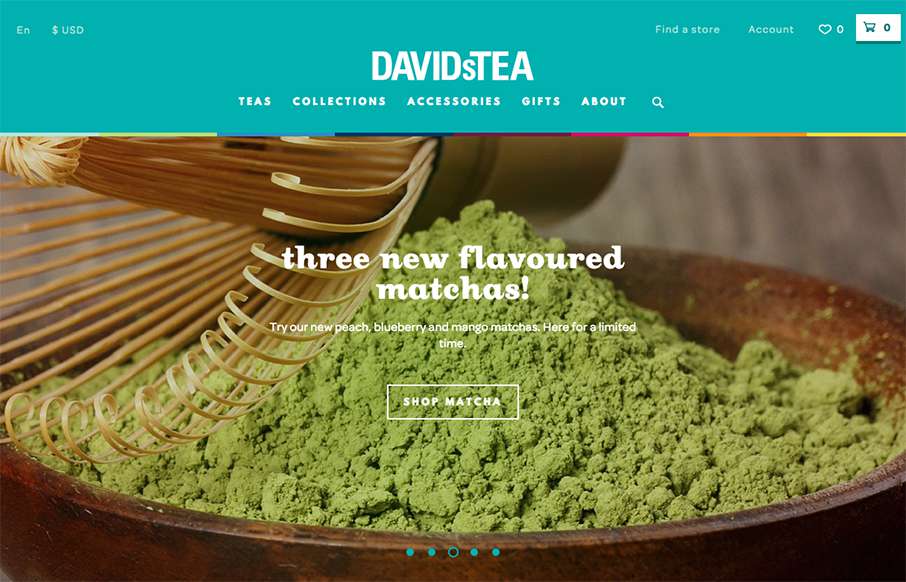
This is a bright and lively site from David’s Tea out of Quebec. It’s incredibly detailed throughout the shopping part of the site – it looks like hundreds of items on the site – and all are beautifully done. My wife is a huge fan of Rooibos Chai – looks like it’s time to get out the credit card!
Glassmorphism: The Transparent Design Trend That Refuses to Fade
Glassmorphism brings transparency, depth, and light back into modern UI. Learn how this “frosted glass” design trend enhances hierarchy, focus, and atmosphere, plus how to implement it in CSS responsibly.


0 Comments