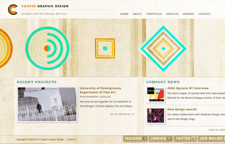
I love the organic yet very mathematical feel to this website. The textures and colors are all so nice I could stare at it all day for some reason. I especially like how the portfolio works with the small scrolling arrow and loading like it feels like it’s on top of the site.
Glassmorphism: The Transparent Design Trend That Refuses to Fade
Glassmorphism brings transparency, depth, and light back into modern UI. Learn how this “frosted glass” design trend enhances hierarchy, focus, and atmosphere, plus how to implement it in CSS responsibly.


0 Comments