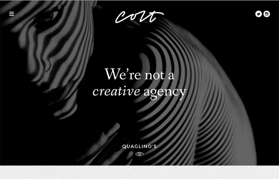
This site design hits all the “now” standard things design and interaction wise. But sometimes you get it just right, I love the smooth feeling vibe to this site and the imagery is quite nice. The way the case study images load as you scroll for the first time down the page probably is a good experience point for your average customer checking them out. Good stuff.
Glassmorphism: The Transparent Design Trend That Refuses to Fade
Glassmorphism brings transparency, depth, and light back into modern UI. Learn how this “frosted glass” design trend enhances hierarchy, focus, and atmosphere, plus how to implement it in CSS responsibly.


0 Comments