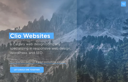
Rather different feeling layout here. I really like the simple color pallet and the background image working together. Then it’s fairly minimal in it’s approach which I always love.
Glassmorphism: The Transparent Design Trend That Refuses to Fade
Glassmorphism brings transparency, depth, and light back into modern UI. Learn how this “frosted glass” design trend enhances hierarchy, focus, and atmosphere, plus how to implement it in CSS responsibly.


0 Comments