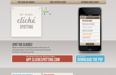
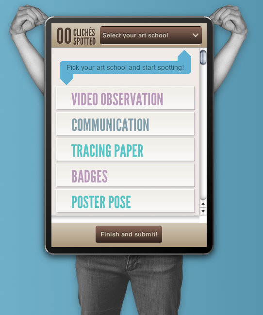
Clever website and iPhone site/app concept. The iPhone site/app is by far superior to the main website in many ways. I do like the feel of it, it has a nice soft feel and the colors all mesh well together. It does indeed have some design cliches to show off and it’s all in good fun, I love that the most.
Glassmorphism: The Transparent Design Trend That Refuses to Fade
Glassmorphism brings transparency, depth, and light back into modern UI. Learn how this “frosted glass” design trend enhances hierarchy, focus, and atmosphere, plus how to implement it in CSS responsibly.


0 Comments