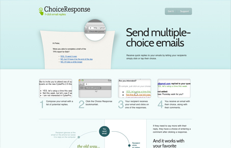
Pretty nifty responsive design. I like how it’s setup design wise on the different screen targets, good looking solution. I think some of the main images are a bit blurry, i’d like to have really sharp graphics on it. Overall I think it’s a good clean design for what looks like a really clever app.


0 Comments