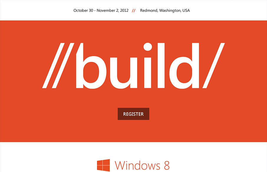
Those fine folks at Paravel have launched a new responsive masterpiece. This time for the 2012 Build conference for Microsoft. Trent Walton posted a nice write up to commemorate the launch:
Lesson learned: Get it in the browser as soon as you can (if you don’t start there). Then, iterate like mad with a team you love to work with. Gosh. I can’t remember a more exciting time to be a web designer.
Sounds like a great lesson there. I also feel like we generally stick too long in Photoshop.
Nishant Kothary also did a quick post about the design process that was fast and furious. I love the fact that the timeframe was so tight and they largely just iterated very quickly between themselves.
…speed-accuracy trade-off applies only to novices. All bets are off if you’re experienced. In fact, focusing consciously and “taking your time” will actually hurt your performance if you’re someone with much experience in the field at hand.
I know I see that the team here at UMS often does it’s best work really fast up front, then most of the time is spent on ironing out details and tweaking.
I love this stuff!


“I know I see that the team here at UMS often does it’s best work really fast up front, then most of the time is spent on ironing out details and tweaking.”
Definitely holds true for the projects that have left me the proudest in the last few years.
Thanks for the shout, Gene. 🙂
You bet Nishant! Great work all around on this one.
Mean Gene! What Nishant said + thanks for the love. We had a great time working on the site.
Greatest .gif on the internet right there.
The site looks fantastic, love the fresh clean design!