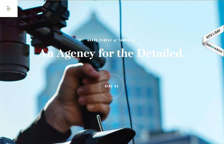
Such solid layout. And that menu nav design is pretty rad. I love the off-kilter approach to the overall layout, it keeps the site feeling fresh, even to someone who looks at thousands of sites a month. 🙂
Glassmorphism: The Transparent Design Trend That Refuses to Fade
Glassmorphism brings transparency, depth, and light back into modern UI. Learn how this “frosted glass” design trend enhances hierarchy, focus, and atmosphere, plus how to implement it in CSS responsibly.


0 Comments