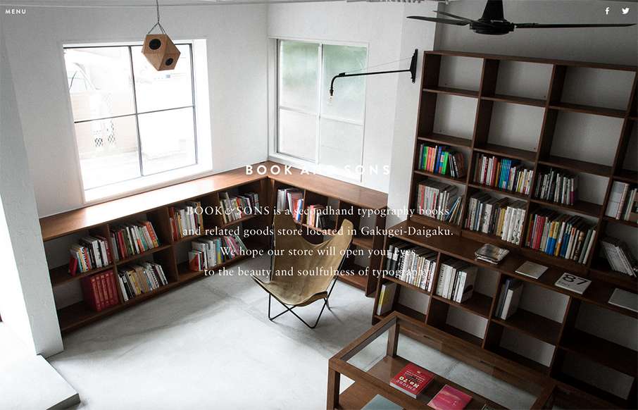
Pretty tidy layout for Book & Sons. I dig the large imagery and the simple nature of the grid at work here. I’m not too happy with the big background images and the white text overlaid on them, sometimes the copy is impossible to read. Fixing that up would leave this site one of the best of the week I think.


The Call to Action, Revisited
The Call to Action hasn’t changed in a decade, but the bar has. A fresh look at prominence, copy, mobile tap targets, and accessibility, with lessons from three major design systems.


0 Comments