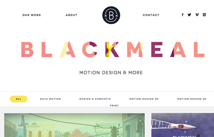
I freaking love the grid layout here for Blackmeal. It’s very dynamic and transitions between screen widths quite well. My favorite part however is the transformative design aspect to the header, as you scroll down, it’s mesmerizing to me. It’s simple but boy is it great design IMHO.
Glassmorphism: The Transparent Design Trend That Refuses to Fade
Glassmorphism brings transparency, depth, and light back into modern UI. Learn how this “frosted glass” design trend enhances hierarchy, focus, and atmosphere, plus how to implement it in CSS responsibly.


0 Comments