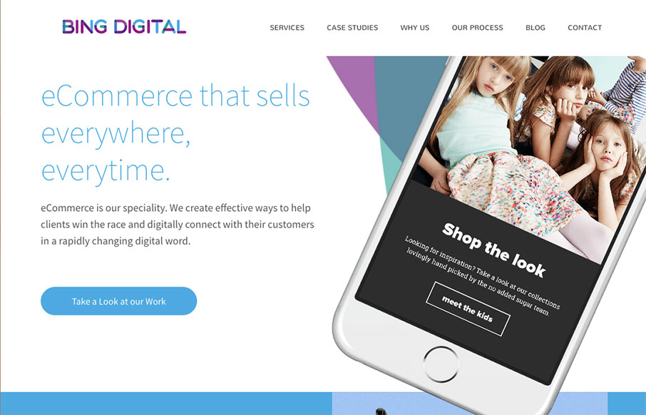
Nice dynamic looking layout for Bing Digital. I love the soft colors and the imagery that helps sell the idea that they know what’s up. The thing I like most is how they list out all the stuff they do in the footer area. So clever and simple, yet most never do just that.
Glassmorphism: The Transparent Design Trend That Refuses to Fade
Glassmorphism brings transparency, depth, and light back into modern UI. Learn how this “frosted glass” design trend enhances hierarchy, focus, and atmosphere, plus how to implement it in CSS responsibly.


0 Comments