
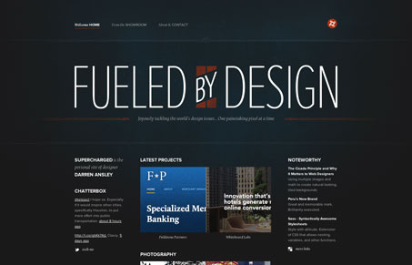
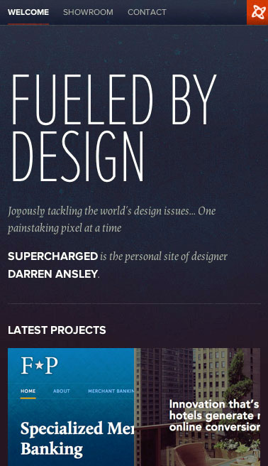
I like the dark background and very open feel to this design. My favorite part is the main logo-type and logo and how it changes as you check out the other screen sizes in this well done responsive website. The logo changes to be part of a more locked in header/navigation and sets up square. Nice touch. Love this design.




0 Comments