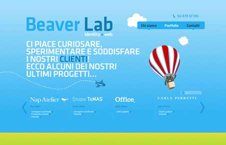
Interesting colors and illustrations coupled with making the page scrolling go in an unexpected way make this simple 3 page website sell itself. It’s clever looking and that might be all it needs. It’s a simple “look me up and see” type portfolio website with a few little surprises. I like that about it.
Glassmorphism: The Transparent Design Trend That Refuses to Fade
Glassmorphism brings transparency, depth, and light back into modern UI. Learn how this “frosted glass” design trend enhances hierarchy, focus, and atmosphere, plus how to implement it in CSS responsibly.


0 Comments