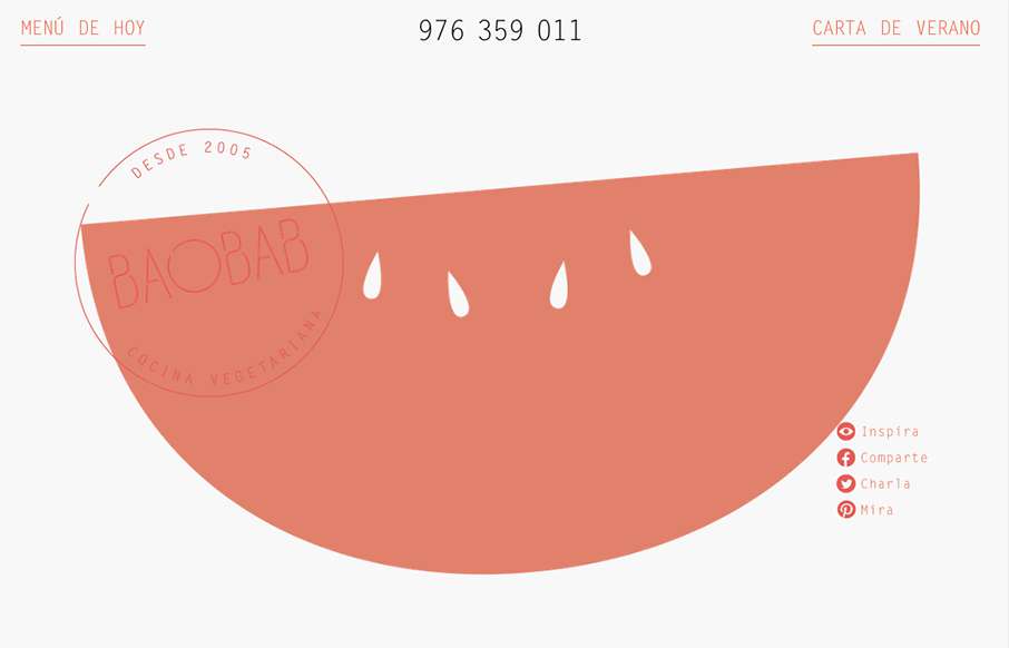
I really like the open feel to this design. The typography and the way it interacts with the white space is also pretty nice in that it feels vibrant and not just minimal. Love the colors and implied simplicity behind the visual layout too.


The Call to Action, Revisited
The Call to Action hasn’t changed in a decade, but the bar has. A fresh look at prominence, copy, mobile tap targets, and accessibility, with lessons from three major design systems.


0 Comments