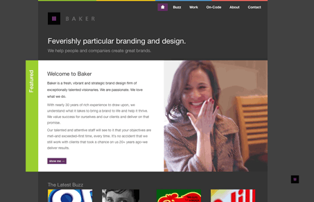
This design is interesting to me, it’s mainly a dark background driven design but it’s one of the few that feels open to me. The spacing between objects is very nicely done. I like colors too, it’s wide open with so many in play but it feels restrained almost at the same time seeing as how we’re only given a little taste of it. I also like the little ‘B’ icon in the bottom right corner taking you to the ‘about’ page.


0 Comments