
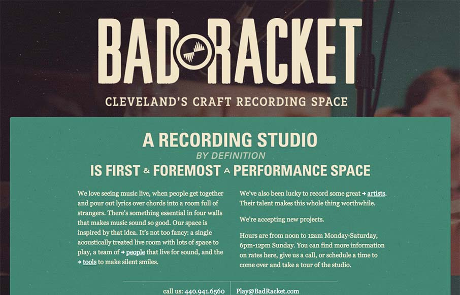
Deceptively simple design is badracket.com. It’s a well designed responsive solution with some nice little goodies spread across it’s single page layout. I love the interstitials designed into the content flow that allow you to open picture slideshows. The small iPhone screen size nav design is also cleverly executed to show the map location as well as the dropdown nav. Also the overall vibe just feels perfect for the subject matter, it almost has a patina on it.


Fitts’s Law: Why the Easy Button Wins
Large, close targets are faster to hit than small, distant ones, that’s Fitts’s Law. A look at the 1954 rule behind buttons, prime and magic pixels, thumb zones, and dark patterns.


0 Comments