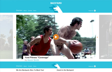
I don’t know much about producing commercials, but I’d imagine that editing is one of the most important aspects. When filming, you most likely end up with way more footage than you keep so things need to be trimmed down, positioned correctly, and polished off. I feel like Backyard’s site is the online representation of that type of effort. It’s very clean, well-structured, has personality, and is to the point. It’s immediately clear not only what their work is, but who is doing it. Each Directors’ page does this very well.
Something I thought was a nice tailored design decision is how the logo reduces in size as you scroll down the page. It frees up a bit of screen real estate while maintaining a useful static header. Overall I think there’s enough playfulness in the design with color, shape, and texture without being too saturated and distracting. Everything is laid out well and the site seems to do a good job of promoting the creativity and fine execution of Backyard’s work.


0 Comments