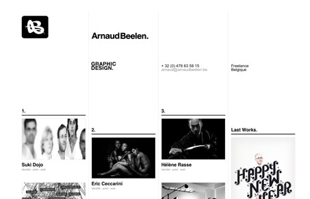
Line based and really feels like a classic design firm type website. I love it. Reminds me a lot of Khoi Vinh’s Web Site, subtraction.com a lot on the sub pages. Probably just the strong black lines doing that. I really like this home page, the random feeling to images in the grid but yet clearly there is a stated structure to it all.
Glassmorphism: The Transparent Design Trend That Refuses to Fade
Glassmorphism brings transparency, depth, and light back into modern UI. Learn how this “frosted glass” design trend enhances hierarchy, focus, and atmosphere, plus how to implement it in CSS responsibly.


0 Comments