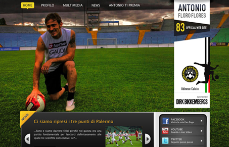
This is a cool layout, I like the way the design uses slightly off aligned spaces and the lines are all slightly crooked. The giant background images are a bit too much I think, just in that they take up so much space at the top of the page, but the effect is cool in the way they are designed. I love those header areas once you get past the oversized images at the top. Lots of great little details here and there make this design a winner.
Glassmorphism: The Transparent Design Trend That Refuses to Fade
Glassmorphism brings transparency, depth, and light back into modern UI. Learn how this “frosted glass” design trend enhances hierarchy, focus, and atmosphere, plus how to implement it in CSS responsibly.


0 Comments