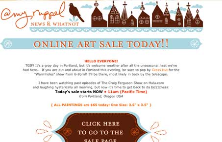
Pretty simple email design, but I like the flourishes at the ends of the shapes that hold the headers and the illustration in the header is really nice. The big call to action in the center of the message is really strong.
You can see the original email’s full layout here.


0 Comments