
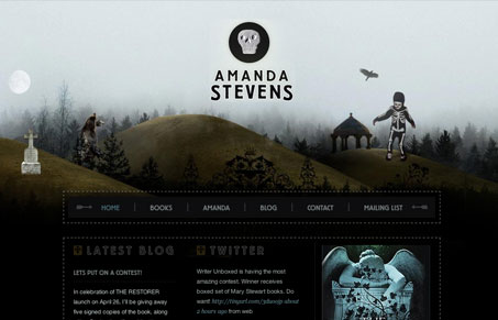
Super nice moody design. I love the main illustration that drives the whole site. Then the inverted footer graphic is clever and interesting visually. It’s a nice compact design with some little flourishes here and there to round it out. Can’t help but make the comparison to them designer’s site: racket.net.au which we’ve featured here before as well.




0 Comments